How to Create a Letterpress Effect Digitally

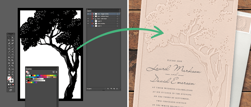
Letterpressing—known for being both luxurious and timeless—is having a moment. This printing option continues to grow in popularity (and it’s easy to see why!) Traditionally, you see this technique a lot in paper invitations or stationery. But letterpressing isn’t exclusive to paper—with the right steps you can add a realistic letterpress effect to your digital designs in Photoshop. We’ve listed some simple steps to help you pull off this look digitally. (You’ll find that this technique is easiest to master on designs that feature a light-colored background!) Happy designing!
Step 1
Open the design you want to letterpress in Illustrator. Move all the graphics you want to letterpress into a separate layer from the background. Name this layer “Graphics.”
Step 2
Create a layer above the “Graphics” layer and name it “Border.” On this layer, place a box that extends beyond the edges of the artboard on all four sides. Make the center of the box transparent and be sure the border has a color selected. (This “border” will help keep your graphics properly centered when you open them in Photoshop).
Step 3
Hide all the layers except for the “Border” and “Graphics” and then save as a PDF file. Name this file “Graphics.”
Step 4
Open a new Photoshop document with the same dimensions of your design file. Add a paper texture to the first layer. Place the “Graphics” PDF file that you just created on the layer above your paper texture.
Step 5
Use this paper texture as your background (keep in mind that the letterpress effect is most easily achieved with a white background). Change the blend mode of your “Graphics” layer to “multiply” from the Layer Blend Mode menu above.
Step 6
With the “Graphics” layer selected, go down to the “FX” button and select “inner shadow.” This will create the illusion that the Graphics have been “pressed” into the paper.
Step 7
Under the “inner shadow” settings, adjust the color, angle, distance, and size to make a soft inner shadow. First, select the color of your inner shadow. If your “Graphics” layer is a single color, you’ll want to select a deeper shade of that color by selecting that color with the eyedropper tool, which you can move down diagonally and to the right of that color. If you have a multi-color design on your graphics layer, selecting a grey or brown often works well. After selecting your color, turn off “Global Light.”
Step 8
Next, adjust the angle and opacity of your shadow. (Setting the angle to between roughly 125 and 180 degrees works well in most situations).
Step 9
Adjust your “Distance” and “Spacing,” or “Size,” depending on which version of Photoshop you are working in. Since letterpressed designs are typically very shallow, you’ll want to keep the distance and spacing small. Set your “Spread” to zero.
Step 10
Now you’ll want to add a highlight. With the “Layer Style” menu still open, select “Drop Shadow.” This will turn your drop shadow into a highlight directly opposite from the inner shadow.
Step 11
Change the “blend mode” from “multiply” to “normal.” Change your shadow color to “white.” Set your opacity to 100 percent. Turn off “Global Light.”
Step 12
Set your angle to the same angle as your inner shadow.
Step 13
Adjust the “Distance,” “Spacing,” and “Spread” to be a similar size as your inner shadow. Here, I will set the “Distance” and “Spacing” to 9 pixels, and the “Spread” back to zero pixels. Hit “OK.”
Step 14
Add one more drop shadow that comes off the opposite side, which will help soften the “inner shadow” and make that pressed edge look slightly rounded.
Step 15
Create a new “group” and move your “Graphics” layer into this group. Add a drop shadow to the group itself. A few steps ago, you turned off “Global Light” on both the inner shadow and drop shadow? Because Global Light was turned off, you can now change the direction of the drop shadow on the group without affecting the direction of the shadows within the group.
Step 16
Rotate the angle of your new drop shadow to roughly 180 degrees of your previous shadows. Change to blend mode to “multiply” and select a soft grey color. (Tip: use the eyedropper tool to select your background color first. Slightly deepen that color for best results).
Step 17
Bring your distance to about 3 pixels, set your size to 7 pixels, and select “OK.”
Congratulations! You’re ready to digitally create a realistic letterpress effect.


