What do an iPhone, an IKEA lamp, and a napkin have in common? They were all imperative in the creation of Greenvelope.com’s latest wedding imagery.
So how did we do it? With just 5 simple steps, you can go from chaos to chic with minimal investment in both time and money.
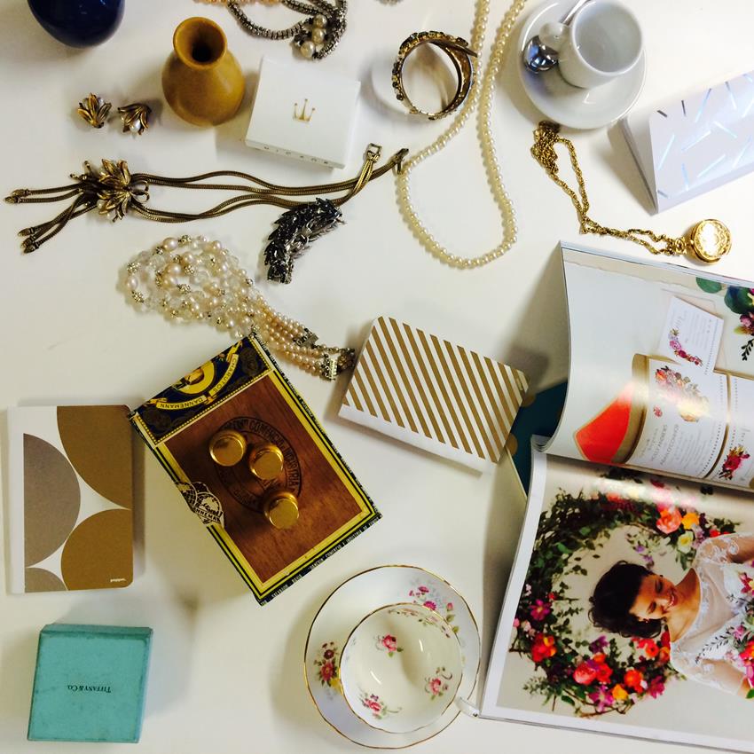
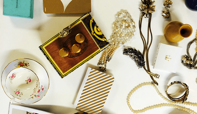
Get Inspired.
Gather a wide variety of beautiful things – fresh flowers from the market, gold-rimmed vintage china, art deco-inspired jewelry – with varying yet complementary textures, colors, patterns, luster, sizes, and shapes.
Envision it.
Whether your style is to do a quick line drawing or an elaborate layout ahead of time, make a concrete plan and vision of what the final product needs to look like. Envision the amount of white space, the placement of various objects and components and how the textures, colors, and spacing need to interact within the final product.

Organize it.
Lay it out, play around, switch it up. Just as with brainstorming, there are no wrong answers here. You can never know how things will turn out until you see it on the screen, so better to have more options than not enough. Key takeaway here: less is more. Don’t try to squeeze every little thing you love into one frame- instead take it as an opportunity to create a few different variations mixing and matching your favorite elements.
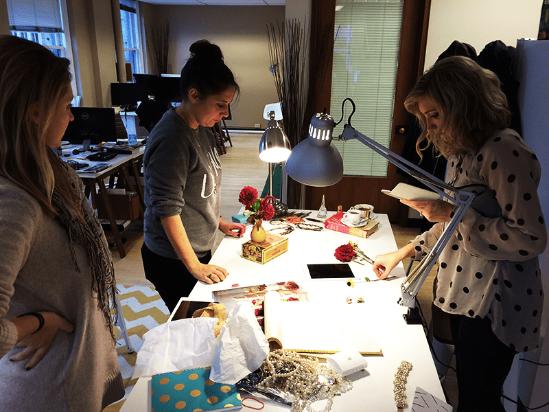
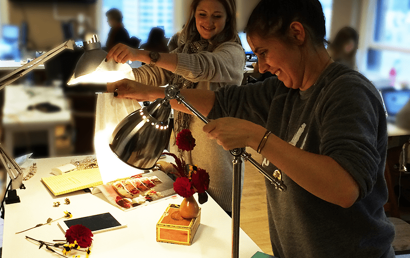
Lights, Camera, Action.
When it comes to photography, light is the ultimate influencer- impacting composition, shadows, and mood. Direct light can create unsightly bright spots and harsh shadows, while the perfect light is abundant but diffused. But who needs softboxes, diffusers or reflectors when you’ve got perfectly good IKEA lamps and napkins?
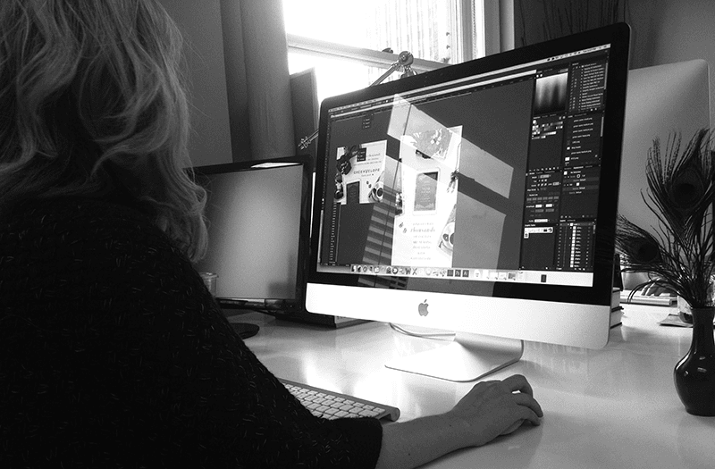
Photoshop it.
Digital editing: an integral part of any ad creation process. While we can do our best to set up perfect spacing, lighting, and color composition in real time, having a resident Photoshop expert (or someone with a subscription to Lynda.com) is key when bringing the final ad creative together.
The Final Product.
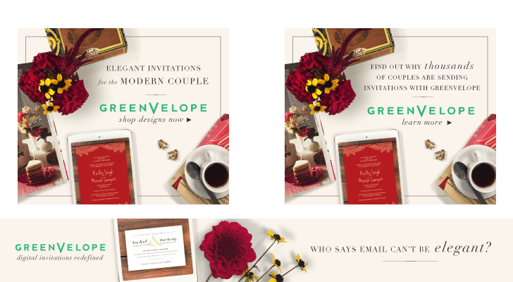
Our Art Director Lauren and Production Design Manager Ashley were inspired by an overall fresh, clean look infused with warmth and art-deco elegance. A burst of vibrance from scarlet dahlias, the contrast of aged oak against a crimson invitation, and shimmering pops of gold and yellow. Integrate that with some flowery verbiage in gorgeous fonts, and that’s where the magic happens.