October 24, 2018
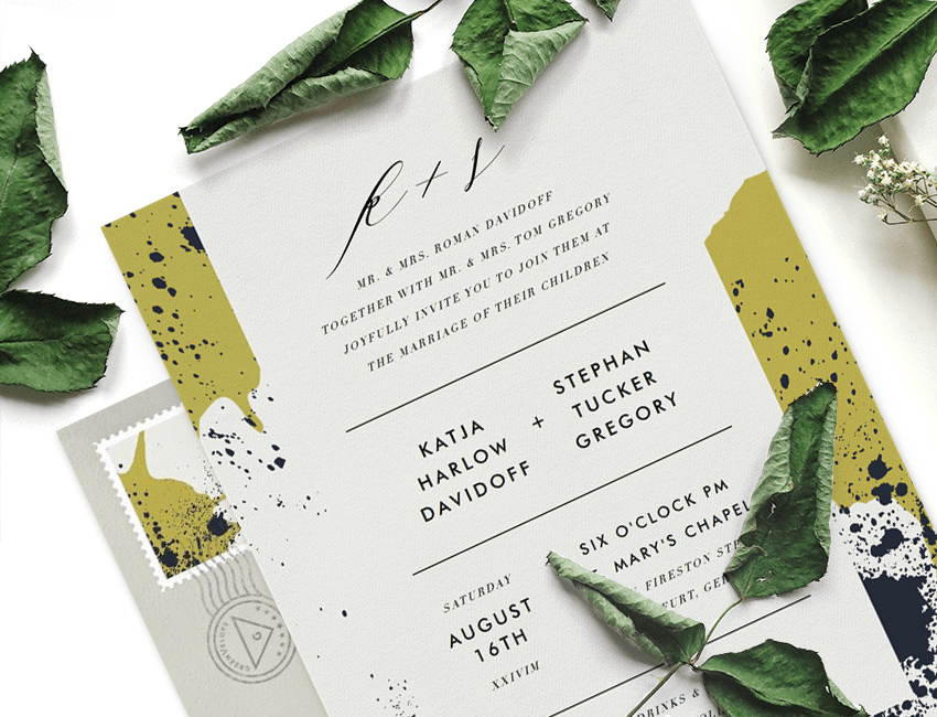
Designer Tips for Laying Out Invitation Text

So you’ve selected that perfect invitation design and now you’re ready to start customizing. We can help! Our team of talented designers have shared some helpful tips for laying out text. From font selections and text positioning to the overall style and aesthetic of your design, keep scrolling to see all their expert tips!
Typefaces
- When it comes to fonts, less is more. A good rule of thumb is to limit your design to two or three typefaces. This will keep your design clean and consistent.
- Avoid using fonts that look too similar. If you’re going to use two similar fonts in a single design—like two serif typefaces—make sure they have enough visual contrast to feel unique.
- Different typeface styles have different levels of legibility. Serif and sans-serif typefaces are considered the easiest to read, followed by script, decorative, or hand-lettered typefaces. For maximum legibility, try limiting smaller text to a serif or sans-serif typeface. You can save the decorative typefaces for event titles or larger lines of text.
- Be mindful of the style and aesthetic your typeface conveys. A classic script typeface will feel formal compared to a hand-lettered typeface, which tends to convey an edgy or playful feel. Similarly, serif typefaces are more traditional, while sans-serif typefaces can feel modern.
Text Layout
- White space is king in graphic design. When laying out text, leave a similar amount of white space on the left, right, and bottom sides of a design to achieve visual balance in the space.
- Create a cohesive feel by sticking with a single justification. For instance, if the body of text in your design is justified in the center—meaning it’s perfectly balanced in the middle of the page—make sure any remaining text is similarly justified.
- Broadening the space between letters or lines of text can help increase legibility. Small text that is formatted in all capital letters is best suited to this type treatment, as it makes the individual letters easier to read and visually digest.
- Less is more when it comes to the amount of text. We recommend moving any peripheral details—like parking instructions or registry links—to Greenvelope’s Details Page. Keep the face of your invitation simple with just the main details of your event (like the name, date, time, and location).
- Use the size and position of your text to create a visual hierarchy of information. Ultimately, you want recipients to notice the most important information first. For instance, you might decide to format the event name and date in a larger text than the location or address.


